Messaging tools for
sports teams
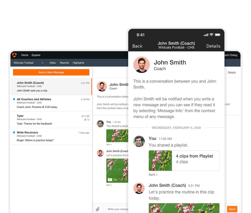
I led the design for messaging features at Hudl, allowing coaches and athletes to send messages, videos, and attachments to each other.
User Research UI/UX Cross-platform

I led the design for messaging features at Hudl, allowing coaches and athletes to send messages, videos, and attachments to each other.
User Research UI/UX Cross-platform
Hudl is a leading sports technology company that builds video analysis and stat tools for over 4.3 million coaches and athletes across 30+ sports worldwide.
Before I started on the project, Hudl had one-way messages from coaches to athletes. The UX was broken because it didn't allow for athletes to respond back to the messages, and it was only available on the web.
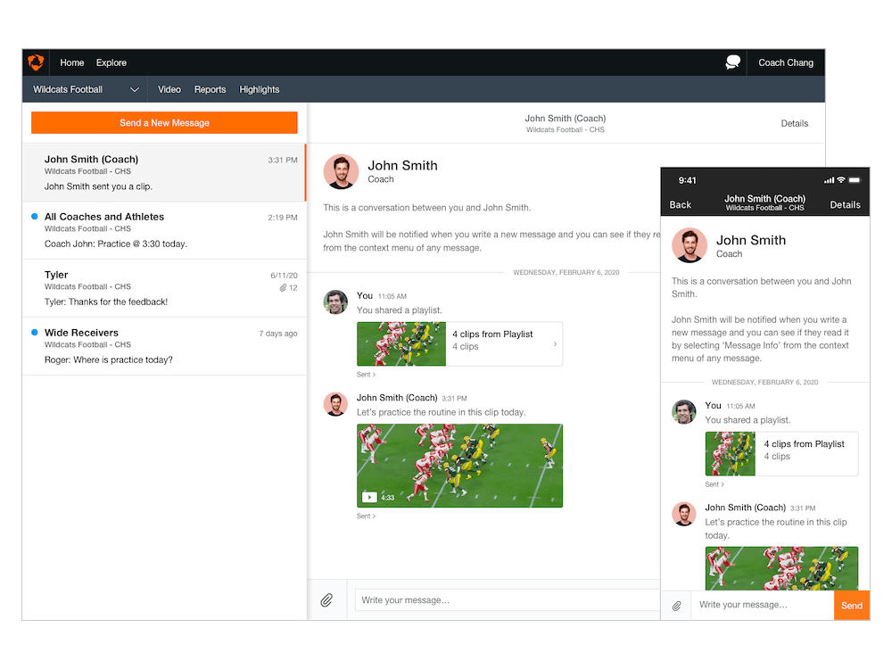
I re-designed Hudl Messages to facilitate two-way team communication. Hudl Messages allow both coaches and athletes to send and receive messages and share content through the Hudl platform. The messages are synced across the iOS, Android and web products.
Our team of six simplified the UX across all platforms, standardized the UI, and focused on improving speed. As the lead designer I was responsible for leading the team through the user research process, iterating on designs through rapid prototyping and usability tests, and creating the UX flows and final high-resolution visual assets.
Before we began revamping the messaging tools, Hudl had an existing beta feature that allowed coaches to send one-way messages to their team.
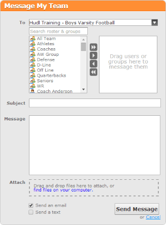
Because it was an in-progress MVP, there were some drawbacks:
The web and mobile UX differed, leading to some mismatched expectations
Messages sent on the web weren’t displayed on mobile
Athletes weren’t able to reply back to their coaches’ messages
Coaches weren’t able to tell if their message was received or read
As we audited this feature and analyzed competing products, our minds spun rapidly with new ideas. However, to figure out what direction we should take and what problems were core to our users, we needed to start afresh. Some guiding questions came to mind:
The research process comprised several efforts:
After conducting several user interviews and on-site visits, several trends became apparent. From this initial response, I began fleshing out common user scenarios and archetypes.
The following insights proved most instrumental in informing our design decisions:
Coaches wanted a centralized place to communicate with their team
High school athletes hardly check email but are highly responsive to texting
Privacy is a key concern, especially for high school coaches
Coaches need to be reassured that their team is receiving and reading their messages
For the first release, we identified two types of personas across different types of sports (large football teams with multiple coaches vs. smaller swim teams): coaches and athletes. Through interviews with teams in Nebraska and Massachusetts, this led the team to three overarching design challenges:
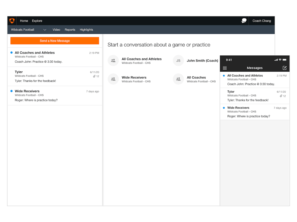
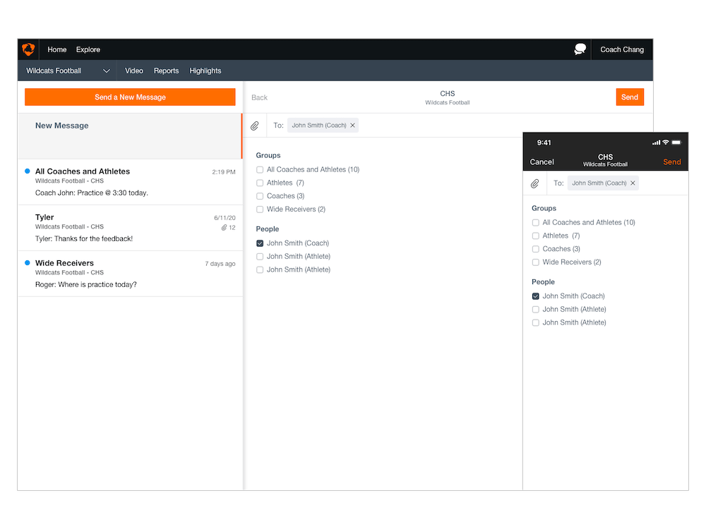
With these use cases in mind, we broke the messaging product into different flows: viewing all message threads, viewing a message thread, and sending a new message.
I led multiple sketch sessions with the team to mock up different solutions to each experience. From these low-fidelity mockups, I created higher-fidelity wireframes and flows that our team could show users for feedback. Tools such as Framer.JS and Pixate allowed me to quickly replicate complex animations and interactions. For nitty-gritty details and copy, I used Sketch plugins that allowed me to display JSON data to mimic how my designs would look like to actual users.
The user research and iteration process helped us form several principles:
Within four months, our team delivered an MVP to hundreds of teams with the following:
© Kevin Chang, All Rights Reserved